
Award360° Annual Design Award
年度最佳商業品牌設計
Best Commercial Branding of the Year
黃河入海餐廳視覺
HHRH Visual Identity
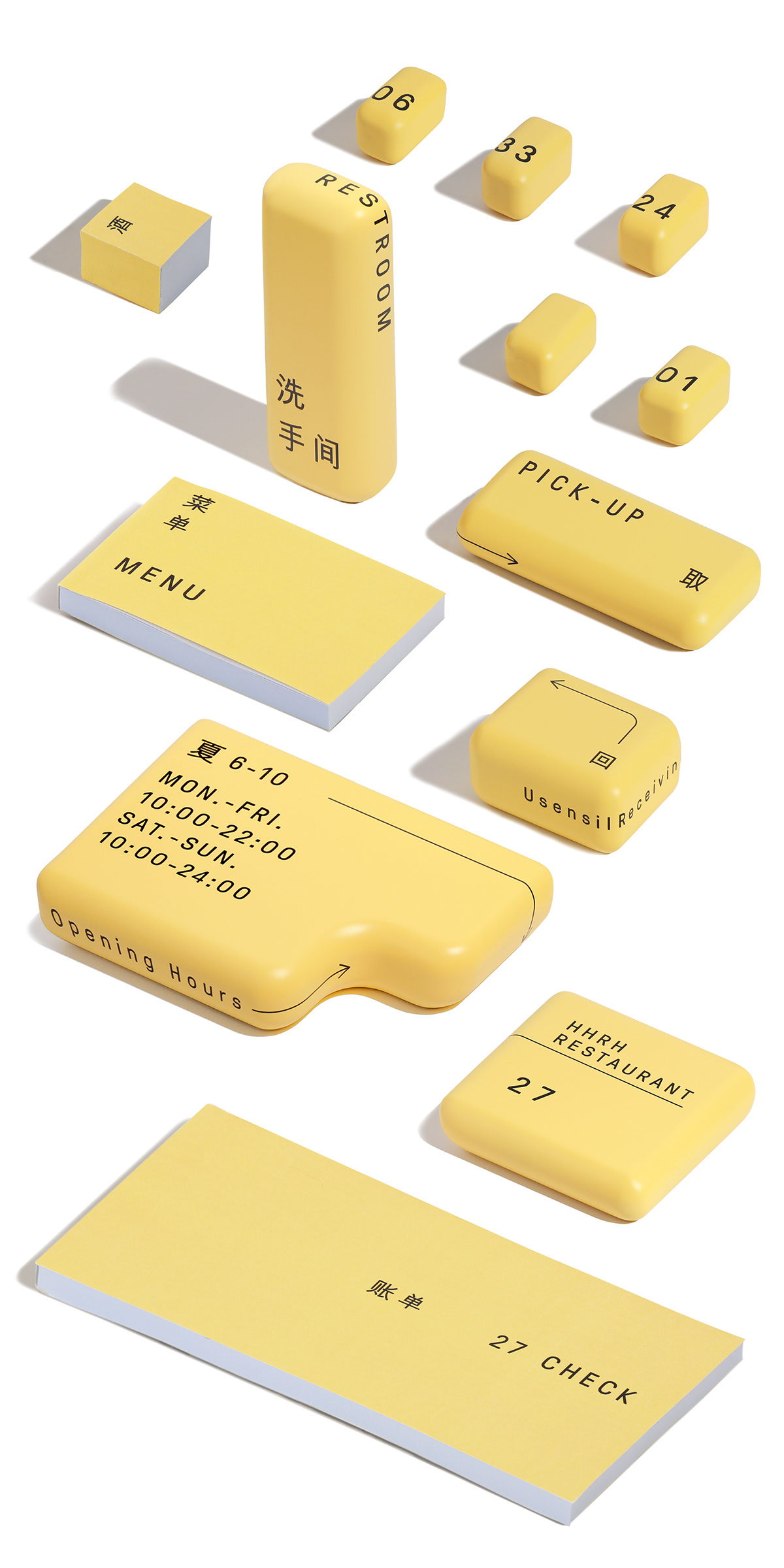
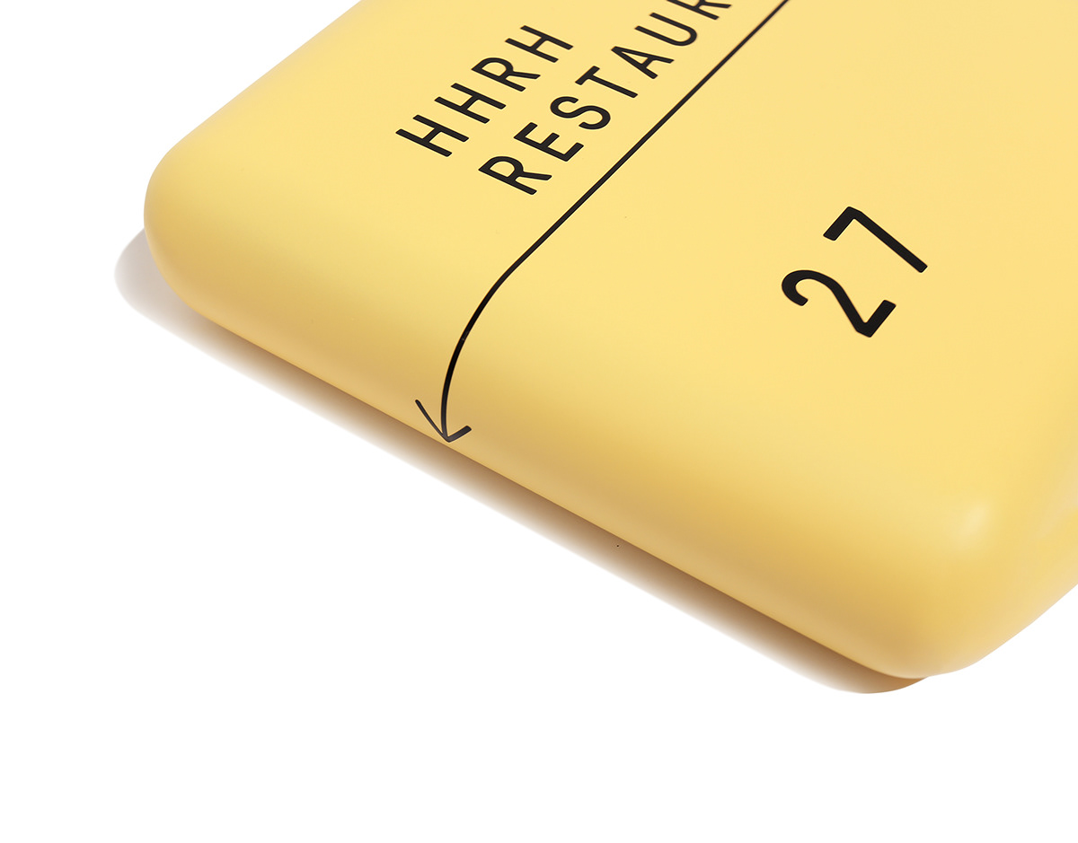
項目位於北戴河阿那亞園區,大田作物事務所從建築方案設計、室內設計到品牌設計和室內視覺導視深入地介入了這一項目。創作團隊希望通過產品設計的方式來設計,用放大倒角的方式獲得一個「產品化」的建築。「大的倒角」給人一種親近感,使建築物更加靠近人。項目的視覺沿用了建築的風格來呈現,黃顏色的鋁板立面,加上文字,讓整個建築視覺更加有整體感和未來感,使來自西北的食物與園區的大海產生一種更具未來感的碰撞。
The restaurant is located in Beidaihe aranya Park. DTZW Studio has deeply involved in this project from architectural design, interior design to branding and interior environmental graphic design. The team hoped to apply the methodology of product design. A “productized” building is obtained by enlarging the chamfer, which gives a sense of friendliness, making the building closer to people. The visual is presented in the architectural style, with yellow aluminum facade and text, making the whole building more integrated and futuristic. It makes the food from the northwest collide with the sea in a more futuristic way.

評委評語
Comments from Jury
通常來說,品牌的視覺識別系統會與品牌的建築、室內設計分別開來,由平面設計師主導,並以「圖形」為核心的表現形式。而這個商業品牌作品則給人帶來了一個平面視覺與建築高度結合的、以「造型」為核心的品牌形象。設計師以產品設計的思維來創作這個識別系統,將品牌設計、建築方案設計、室內設計和室內視覺導視等不同的學科都用產品設計串聯起來,為觀眾塑造一個從裡到外都十分統一、強烈的視覺感受。
Generally speaking, the visual identity system of a brand is separated from its architectural and interior design, and is dominated by graphic designers, with “graphics” as the core form of expression. However, this commercial branding work brings a brand identity highly integrating graphic visuals and architecture, with “shape” as the core. The designer creates this visual identity system from the perspective of product design, connecting different disciplines, such as branding, architectural design, interior design and interior wayfinding system, creating a highly unified and strong visual sense from inside to outside for the audience.
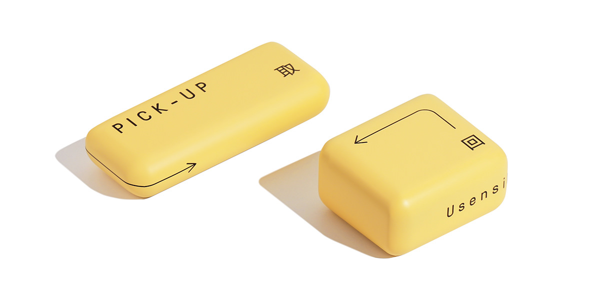
這家餐廳位於北戴河阿那亞園區。設計師意在為外來短居的人們帶來一種新的美好的可能。「大倒角」的使用是這家餐廳的視覺識別的主要特徵,它貫穿於視覺系統的每一部分,使整個餐廳的建築、室內與品牌視覺都具有連貫的系統性和延展性。在清冷寧靜的海邊,其明亮又柔和的黃色加上無襯線體文字的使用,更是給人營造了一種來自西北的親近感。而它與浩瀚無際的大海產生的碰撞,又讓人似乎進入了一個未來的世界。
This restaurant is located in aranya Park, Beidaihe. The designer is intended to bring a new and beautiful possibility to the people who live there temporarily. The use of “large chamfer” is the main visual feature of this restaurant. It is thoroughly applied in every part of the visual system, making the architecture, interior, and the visual identity of the entire restaurant a system with high coherence and extensibility. The bright and soft yellow and sans-serif text create a sense of intimacy form the northwest in the chill and quiet seaside. In the meantime, its collision with the boundless sea makes people seem to enter a future world.


這件作品的難能可貴之處在於,設計師運用產品設計思維,將建築、品牌視覺、室內設計和導視等不同的學科系統地放置於同一個品牌識別系統中,以「打造一個產品」的面向來統一考慮。因此,它每個部分的設計表現都能相互契合與聯繫,使這家餐廳的品牌視覺達到高度統一,帶有很強的完整性,從而給人留下深刻的印象。
The commendable part of this work is that the designer systematically places different disciplines such as architecture, graphic visuals, interior design and wayfinding system, etc. into the same brand identity system through product design thinking, considering them in a unified way from the perspective of “building a product.” Therefore, the design of each part of the restaurant can fit and connect with each other, so that the visual identity of the restaurant achieved a high degree of unity, with strong integrity, and thus leave a deep impression.


此外,設計師打破了品牌視覺以平面圖形為主要表現形式的傳統,並深入考慮如何將視覺識別應用於空間中,創新地以立體造型介入其中,給人帶來啟發。在中國新品牌不斷湧現的當下,這樣統一的品牌識別是給消費者留下強烈品牌印象的強力武器。此外,產品設計的思維方式和敘事方式,不但讓商業品牌的視覺獲得一種創新的表現,也給設計師一個全新的看待品牌視覺系統的視角。
In addition, the designer broke the tradition of taking 2D graphics as the main form of brand visuals, and deeply considered how to apply visual recognition to space, and innovatively intervened in it with three-dimensional modeling, which is found to be inspiring. On the one hand, such a unified visual identity is a powerful weapon to leave a strong impression on consumers in an era when new brands are emerging in China. On the other hand, the way of thinking and narrative of product design not only gives the visuals of commercial brands an innovative expression, but also brings designers a new perspective on brand visual identity system.


設計團隊
Designed by
大田作物設計事務所
dtzw design studio
dtzw design studio
⼤田作物簡稱dtzw,成⽴於2009年,是⼀個綜合性的設計事務所,結合品牌、空間、產品的多元設計工作室一直在努力產生更多有趣的項目。dtzw(大田作物)呈現著自由生長的蔥蘢姿態,一如團隊對它所寄予的「茁壯成長」的期望。2018年出於對植物的原始好感,打造出了自己的品牌「超級植物公司」。
E : dtzwgood@163.com
Credits
DA - 大田作物設計事務所
AD,CD - 李習斌
D - 李習斌,陳曉兵
PT - Jonathan Leijonhufvud
C - 黃河入海HHRH


